Cascading Nordic light upon his fellow Scandinavian botanic habitants,
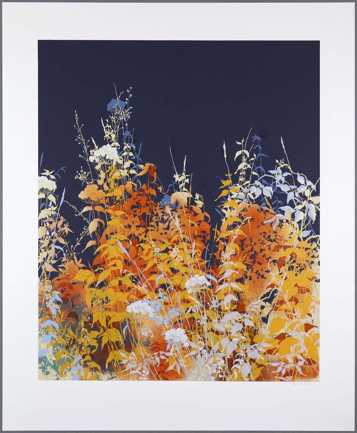
Henrik Simonsen has revitalised a genre of Expressionism. The artist’s vibrant works are intriguing, telling capturing stories at eye level with ancient grasses, bushes and trees; leafy dwellers he knows very well from his childhood in the Danish countryside. Starting by hand-drawing the contours of the chosen subject matter, Simonsen organically builds the works, layer by layer, using colour to create depth. Amber Dusk and Gold Dusk from 2013 are two screenprint editions representing a period where the artist’s works altered from detailed scenery to a more abstract expression seen in the following years.
Like all good stories, the natural landscapes by Simonsen are never exactly as they seem. On the surface everything resembles familiarity, as the perfection of a glossy image, but beneath it lies intrigue and deception. Grasses are no different than the rest of us. Unimportant as they rise from the dusty-brown soil - strong, tall and swaying gently in the wind - they have an existentialistic purpose to fulfil, and will not hesitate to take aim at you should you get too close. As most children growing up in the countryside, Simonsen learned the weaponry of his green adversaries early in life - and which to avoid despite their haunting beauty. The Nettle with its heart-shaped and apparently soft leaves, but stems covered in tiny, stiff hairs that release stingy chemicals when touched; or the far more menacing Hemlock whose small white clustered flowers and black fruits will send even grownups to the afterlife.
Contrary to other artists, who reserve ordinary greens to the background in their compositions, grasses are a favourite subject matter to the Danish artist. In Simonsen’s work they are lifted to the foreground, depicted in all their natural beauty, flooding them in seductive lighting - hence purposely luring the viewer into a sense of ease.
Amber Dusk and
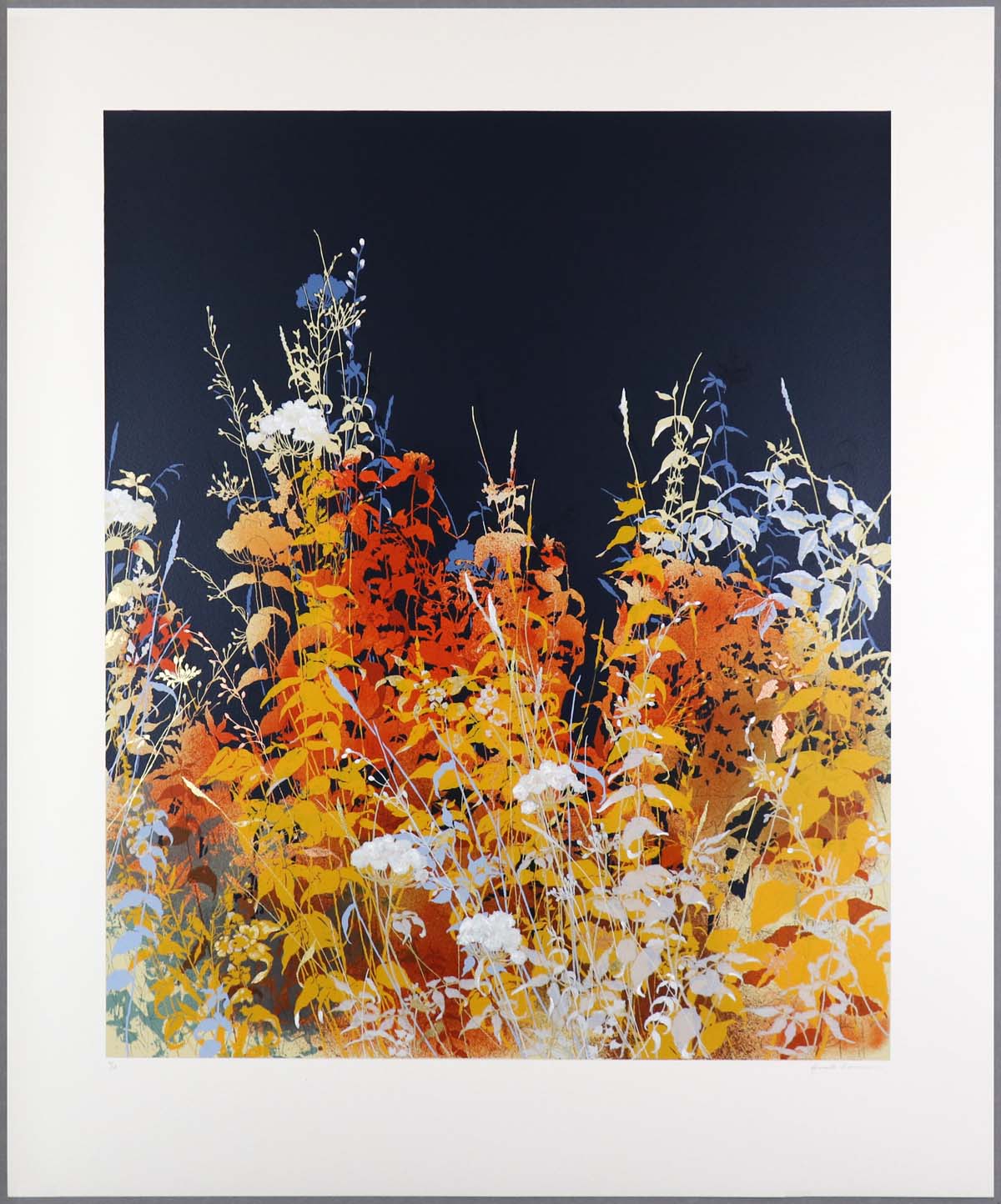
Gold Dusk are two works by the artist dedicated to his fascination with grasses. From the back, the Wild Angelicas are seemingly disappearing in the blue darkness and only visible as silhouettes - and moving toward the front, Nettles, Marsh Woundwort and Mugwort glow in golden hues, overlayed by the bundled tiny white petals of Wild Angelica and Hemlock. In between the layers, Meadow-grass is seen with long leave-less stems and small flower buds at the end; some blooming in the foreground with small rounded flowers like Daisies.
HENRIK SIMONSEN
Amber Dusk, 2013
Edition of 70
8 Artist Proof (APs)
94(w) x 113(h) cm
37.01(w) x 44.80(h) inches
HENRIK SIMONSEN
Amber Dusk, 2013
Edition of 70
8 Artist Proof (APs)
94(w) x 113(h) cm
37.01(w) x 44.80(h) inches
|
|
|
94(w) x 113(h) cm
37.01(w) x 44.80(h) inches
|
15 colour screenprint on 300gsm Bockingford paper
Image size: 90.6 x 75.2cm
To see larger and more detailed image (1Mb file opens in new window), please click here
Signed and numbered on front.
Edition of 70
|
|
Perceived today by many people as weeds, to Simonsen these common plants are a proud part of the Scandinavian flora - and the survivors of ancient times. Botanicals enthralled with myths and legends; as healing plants up through the middle ages; and later, in the 19th century fairytales by H.C. Andersen where Daisies and Nettles are lifted to literal magnificence in short stories such as ‘The Daisy’ and ‘The Wild Swans’.
As with many of the artist’s pieces, and the works of other artists representing Nordic Expressionism, the unique light in the northern hemisphere is an integral part of the palette. Simonsen regularly returns to a time of day when the sun is low in the horizon, the so-called “blue hour”; an hour when dusk starts to settle and colours change very quickly. Some fade into neutral, while others seem to almost glow in the incoming tide of darkness. Whites, yellows, paler blues and some oranges do this. The lighting of
Amber Dusk and
Gold Dusk creates a symphonic display of such colour characteristics; the ones that fade into the darkness and the others that possess a glow.
Observing the last rays of light letting go in the horizon or the first beams flooding over the landscape, is the inevitable circle of life; what is created will come to a conclusion - and an ending always connects to a fresh beginning.
From the first touches of a new artwork, Simonsen’s scenery grows organically through the botanic outlines drawn by hand - and then subsequently building the layers of colour on top, one at a time, to create depth. The use of fine dark pen strokes and tinted markings to create highlights, enhance the contours of leaves and stems.
Over the years, Simonsen have often considered creating an edition with some hand-applied elements to make each print unique, but even with edition sizes around fifty, this has not been practical. Whereas a painting allows an artist to delve into the creation of one artwork which is completely original, screenprint editions are manually printed from layers of screens, making each one close to identical. With
Gold Dusk he found a way to create a hybrid between the painting and the print edition. Being a small edition of only fifteen, Simonsen added extra layers of colour to deepen the blue backdrop, used his white-paint brush on the little flowers of the Wild Angelicas and applied copper and gold metal leaf to make some leaves glow in the setting sunlight. These touches make each print of
Gold Dusk unique.
HENRIK SIMONSEN
Gold Dusk, 2013
Edition of 15
2 Artist Proof (APs)
94(w) x 113(h) cm
37.01(w) x 44.80(h) inches
HENRIK SIMONSEN
Gold Dusk, 2013
Edition of 15
2 Artist Proof (APs)
94(w) x 113(h) cm
37.01(w) x 44.80(h) inches
|
|
|
94(w) x 113(h) cm
37.01(w) x 44.80(h) inches
|
19 colour screenprint on 400 gsm Velin Arches Blanc paper with hand-applied gold and copper leaf, uniquely hand-finished by the artist.
Image size: 90.6 x 75.2cm
To see larger and more detailed image (1Mb file opens in new window), please click here
Signed and numbered on front.
Edition of 15
|
|
Wherever the paintings go, the prints often follow - and in 2014 the artist embarked on a new artistic journey creating a body of work embracing a more abstract expression; colours were fewer, defined contours changed into smooth silhouettes and the shapes became bolder. Looking back on his practice,
Amber Dusk and
Gold Dusk represent two important works signalling the closing of a chapter of diligently detailed works - and the beginning of the colourful expressionist works Simonsen creates today.
Released at the beginning of the autumn in 2013,
Amber Dusk and
Gold Dusk, are two of the earliest print editions presented in a collaboration between
Henrik Simonsen and Eyestorm. Although the two prints are identical in paper size and composition, it is the details that sets them apart. Impressive with its manually layered 15 screenprinted colours,
Amber Dusk is a captivating work in an edition of 70. In
Gold Dusk, more layers of ink have been applied to give further depth to the dark-blue backdrop - and the edition of only 15 is uniquely hand-finished with acrylic paint and layers of gold and copper metal leaf. Both editions are signed and numbered on front by the artist.
You can find more information about the two print editions on
Henrik Simonsen’s artist page
here.